
Tennis Website
Professional tennis coaching, a click away
The Challenge:
Managing lesson bookings solely through text messages has become a hassle for both the coach and his clients. Coordinating schedules, answering availability questions, and keeping track of appointments manually takes up valuable time that could be better spent on the court.
The Goal:
Create a streamlined, user-friendly website that allows clients to easily view the coach’s availability and book lessons in just a few clicks. By integrating a scheduling tool and providing clear service details, the site will simplify the booking process, reduce administrative work, and give clients a seamless way to secure their lessons.
Project Overview
Role: UX Designer
Tools: Figma, Google Forms (for surveys), Paper Wireframing
Duration: March 2025
Problem Statement: Without a centralized system, managing availability, confirming appointments, and handling reschedules becomes a frustrating back-and-forth, leading to potential missed opportunities and scheduling conflicts.
Solution: With clear service information and an integrated scheduling tool, the site simplifies appointment management, saves time, and provides a more professional and seamless experience for both the coach and his clients.
The Design Process

Empathize
Understanding users' needs, emotions, and challenges through research to create meaningful, user-centered solutions.


Define
Analyzing research insights to clearly identify the problem, ensuring the design solution directly addresses users' needs.


Ideate
Brainstorming and exploring creative solutions to address the defined problem, focusing on innovation and user needs.


Iterate

Prototype
Creating interactive models or mockups of a solution to test ideas, gather feedback, and refine the design before development.


Iterate
Test
valuating prototypes with users, gathering feedback, and making improvements to ensure the final product meets their needs effectively.
Empathize & Define
User Research- Survey
I performed user research by interviewing 5 clients of the coach. I met with them before or after their lessons to discuss some questions. The survey posed questions going into depth about scheduling lessons with the tennis coach in the previous method.
Key Questions
How do you currently schedule lessons, and what challenges do you face?
What information do you need before booking a lesson?
What hold you back from scheduling lessons?
What I found- user pain points:
Lack of availability visibility
Both parents and students expressed frustration about not knowing the coach’s open slots in advance, leading to uncertainty in scheduling.
A mobile friendly way to book
The student participants said they’d be more likely to take charge of their scheduling if there were an easy way to book lessons from their phones.
Texting is time consuming
Every parent mentioned having to text back and forth with the coach to find an available time, which can take hours or even days to confirm a lesson.
The cost of missed lessons
Both parents and students mentioned that they sometimes forget about scheduled lessons, especially if they book far in advance.
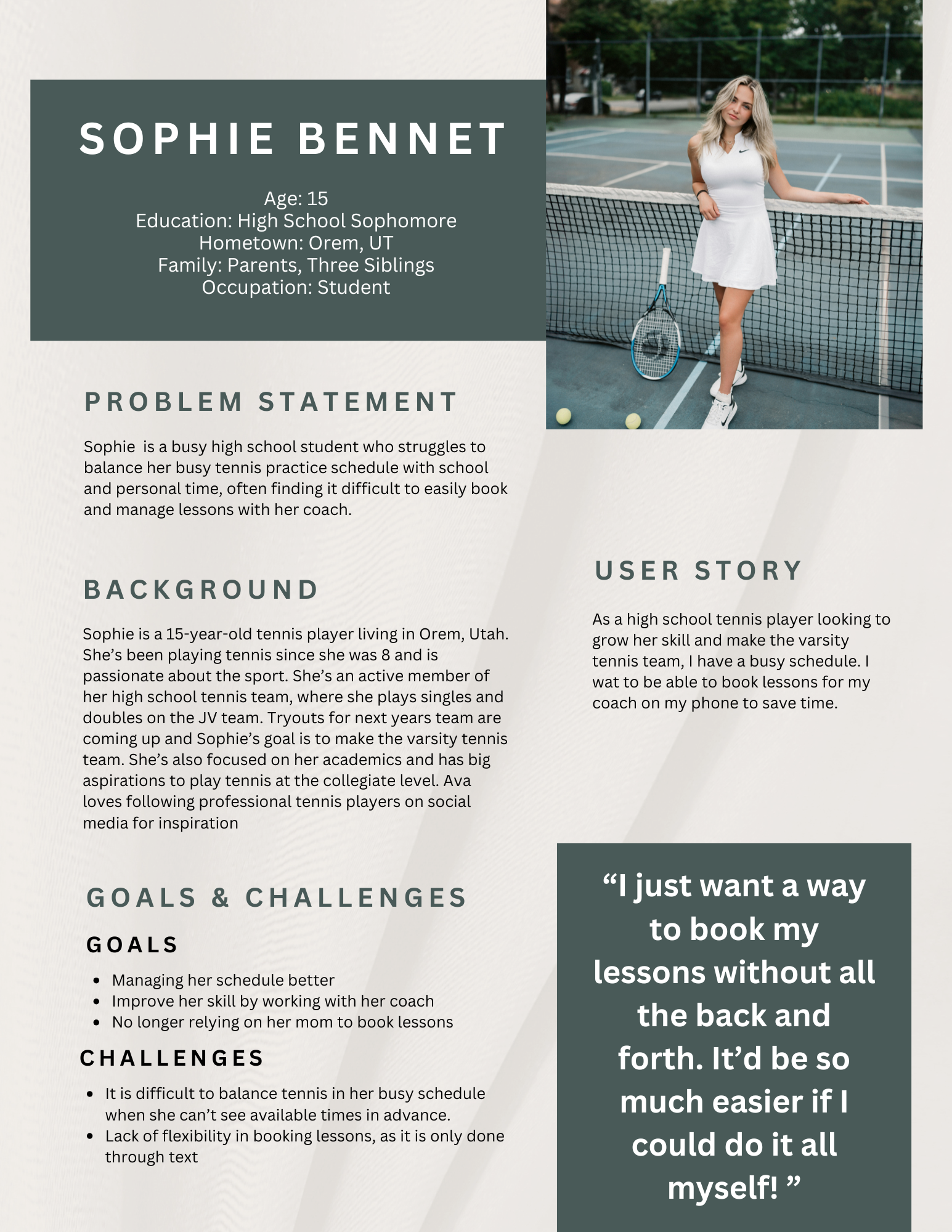
User Personas
User personas help keep design focused on real people, not just assumptions. By creating a profile based on actual research, I am better able to understand user needs, behaviors, and frustrations—leading to more intuitive and user-friendly experiences.
Meet Sophie!
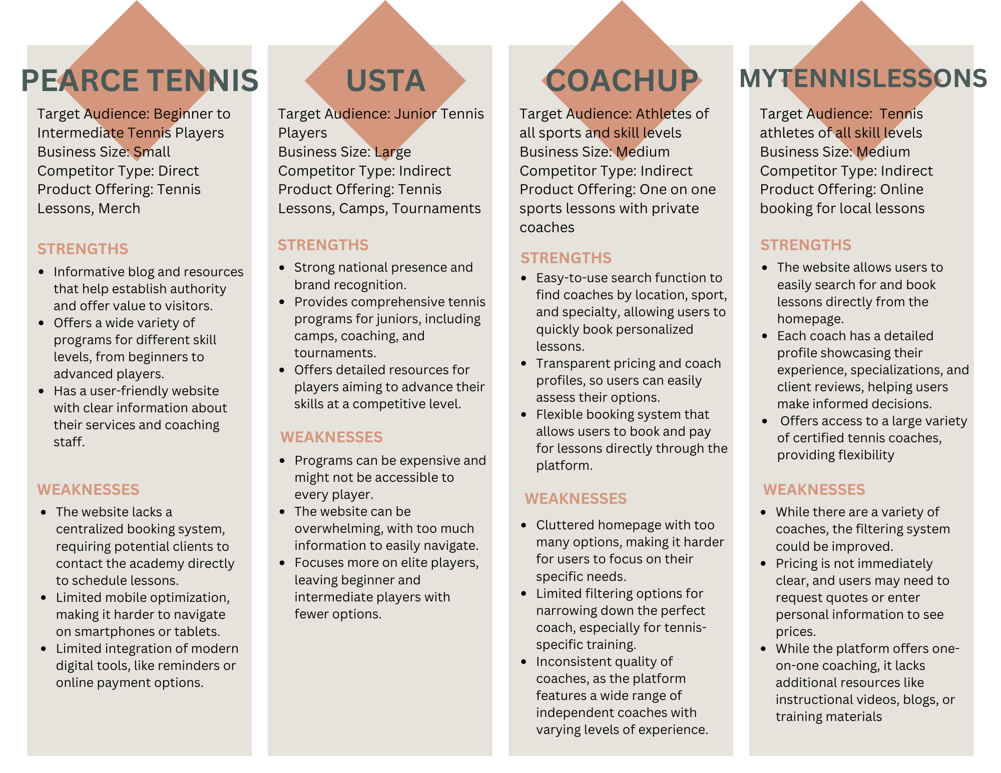
Competitive Audit
By looking at competitors’ strengths and weaknesses, I can create designs that stand out, solve user pain points better, and offer a more unique and user-friendly experience. It’s all about learning from the market to make smarter design decisions!
Ideate
Brainstorming
How Might We?
"How Might We" (HMW) is a problem-framing technique used to turn challenges into opportunities for innovation. It helps me brainstorm creative solutions by reframing user problems as open-ended questions.
How might we make scheduling lessons more seamless for both the coach and students?
The back and forth messaging to schedule lessons could be leading to decreased bookings.
Possible solutions: Integrated booking feature so that there’s no need for texting back and forth
How might we improve communication between the coach and students/parents?
New clients may have no way to reach the coach to meet or book lessons
Possible solutions: Messaging feature or notification system
How might we make the website feel more personal and welcoming for new students?
Some sites can feel impersonal, and people like to know what they will be getting.
Possible solutions: Intro from the coach sharing his background, coaching style, etc.
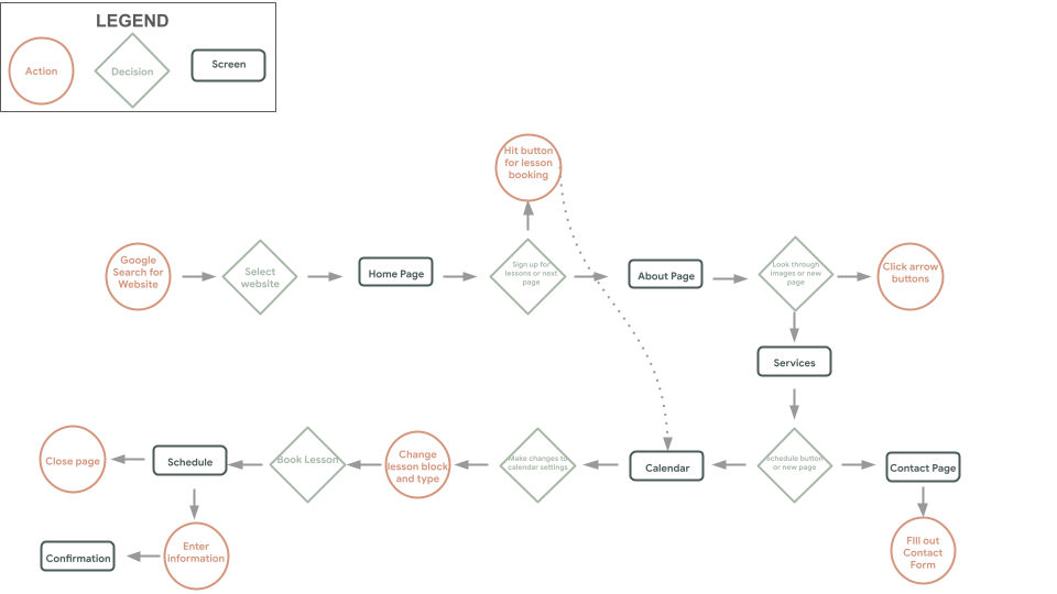
User Flow
My next step was to block out the user flow throughout the website. This helps improve usability and gives me a clear user flow to track through the site.
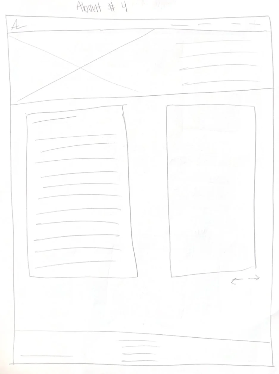
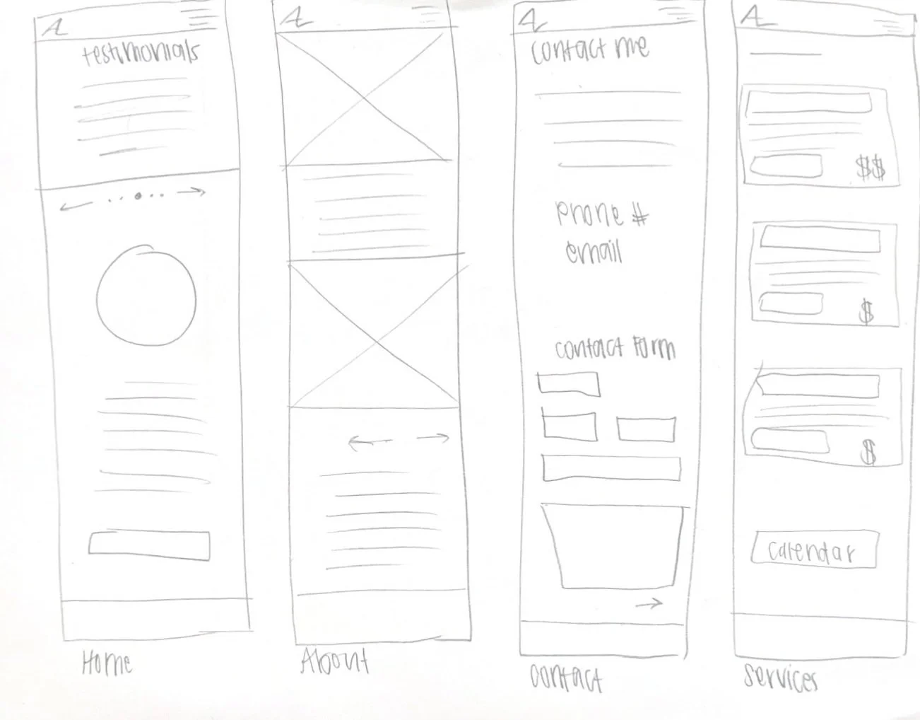
Paper Wireframing
My first step in designing the site is paper wireframing. This is a low cost way for me to rapidly try out as many ideas as possible by exploring layouts, testing different structures, and iterate rapidly without getting caught up in details. By focusing on the overall user flow and key elements, it helps me identify potential issues early in the design process and select key elements I would like to use in my later designs.


Size Variations

Digital Wireframes
Digital wireframes take rough ideas and turn them into something more structured and interactive. They’re all about laying out content, navigation, and functionality without worrying about colors or visuals yet. Using Figma, they make it easy to tweak and test layouts before going too deep into the design. It’s a simple but super important step to make sure everything flows smoothly before adding the final details!


Prototype
Connecting
Mockups
Mockups bring designs to life by adding visuals, colors, typography, and branding to wireframes. They’re the first look at how a final product will actually feel, making it easier to spot design issues before development. This step is all about refining details, making sure everything looks cohesive, and ensuring the design is both functional and visually appealing.


Prototypes
Prototypes take designs a step further by making them interactive, letting me test how everything flows before it’s fully built. They help me see if the user experience feels smooth, catch any problem areas, and get real feedback from users. I use prototypes to bring ideas to life, whether it’s a simple clickable wireframe or a more polished version of the final design. It’s all about refining and improving before anything goes live!
Testing
Usability Studies
Moderated Usability Study
I ran two usability studies to see how real users interacted with my designs. The first study, after the lo-fi prototype, helped me catch early usability issues and refine the overall flow. The second study, after the hi-fi prototype, focused on the details, making sure the experience felt smooth and intuitive. Both studies gave me valuable insights that shaped the final design, helping me create a product that truly works for users.
How easily can users navigate through the website to find coaching services and schedule a lesson?
How intuitive is the booking process, and are there any points of friction?
What percentage of users are completing a booking once on the website?
Is there anything that the majority of users are having a hard time locating on the website?
How long is a person spending on the website on average?
Research Questions
Moderated usability study with 5 participants taking place the week of October 24-31.
Data will be collected by audio and video recording. My own observations will be recorded on sticky notes during the interview.
Data will be analyzed using an affinity diagram.
Methodology
Participants are students or parents of students who use the coach for tennis lessons- therefore having firsthand experience with his previous booking method.
3 female, 2 male, ages 16-48.
No users of assistive technologies.
Incentive: Discounted Lesson
Participants
Time on Task
Task Success Rate
User Satisfaction Score
Retention Rate
Key Performance Indicators
Script and Findings
Prompt
Can you find information about the coach’s background and qualifications for me?
Follow-up 1: Did you find enough information to feel confident booking a lesson?
Follow-up 2: Is there any information you feel is missing?
How would you approach the task of booking a lesson?
Follow-up 1: Try it now, please.
Follow-up 2: Were there any points where you felt stuck or unsure of what to do next?
How does the design of the website affect your perception of the tennis academy?
Follow-up 1: What aspects of the site make it feel professional or unprofessional?
Follow-up 2: Are there any changes that you would make?
If you were to access this site on a mobile device, what do you think your experience would be like?
Follow-up 1: Did you notice any accessibility issues that might make it difficult for certain users to navigate?
Follow-up 2: Would you be likely to use this in the mobile format?
Can you tell me how you would find information about the available coaching services?
Follow-up 1: How easy was this to find?
Follow-up 2: Was there anything confusing or unclear during this process?
Round 1 Findings
Most users struggled to locate the scheduling tool quickly
Most users expressed a need for a confirmation page after booking a lesson
Users expressed interest in a contact button on the home page as was used in Lo-Fi
Round 2 Findings
Users felt that the site lacked clear CTAs to guide them through the scheduling process
Most users completed the scheduling process faster in the second round
Some users felt that some sections of the website were too content heavy
Iteration is a huge part of my design process because no design is perfect on the first try. Testing and feedback always reveal ways to make things better, whether it’s tweaking a layout, adjusting a flow, or reworking a feature to be more user-friendly. Each round of changes gets the design closer to something that actually works for real people.
Iterations


In my iterations I added a contact button to the home page to direct more users to one of the main goals of the website. I also simplified the about page to make it more visibly appealing for users.
Thank you for your time. Please don’t hesitate to reach out to me about reviewing more of my work.