
Author Site
A Digital Home for Author Devin Downing
The Challenge:
This author wants a website that not only showcases his books but also makes it easy for readers to purchase them with as few steps as possible. Additionally, he hopes to build a stronger connection with his audience by encouraging them to sign up for his newsletter, where he can share updates, exclusive content, and upcoming releases. His existing site is hard to navigate for users.
The Goal:
The goal is to design a site that is both visually engaging and user-friendly. The site should provide a seamless browsing experience, making it easy for visitors to explore his work, learn more about him, and take action—whether that’s purchasing a book or subscribing for updates."
Project Overview
Role: UX Designer
Tools: Figma, Google Forms (for surveys), Paper Wireframing
Duration: November- December 2024
Problem Statement: Author Devin Downing wants to increase book sales on Amazon and grow his newsletter audience, but he lacks a dedicated website to guide readers. Without a central hub, potential readers may struggle to find his books or sign up for updates.
Solution: I designed a user-friendly website that serves as a central hub for Devin Downing’s books and newsletter. The site provides a seamless browsing experience, making it easy for visitors to learn about his work, purchase books through Amazon, and subscribe for updates—all while reflecting his brand as an author.
The Design Process

Empathize
Understanding users' needs, emotions, and challenges through research to create meaningful, user-centered solutions.


Define
Analyzing research insights to clearly identify the problem, ensuring the design solution directly addresses users' needs.


Ideate
Brainstorming and exploring creative solutions to address the defined problem, focusing on innovation and user needs.


Iterate

Prototype
Creating interactive models or mockups of a solution to test ideas, gather feedback, and refine the design before development.


Iterate
Test
Evaluating prototypes with users, gathering feedback, and making improvements to ensure the final product meets their needs effectively.
Empathize & Define
Research & Analysis
User Research- Survey
I developed a list of targeted questions and interviewed friends and family familiar with the author’s work. This allowed me to gather insights from individuals who were already engaged with his content, helping to identify potential pain points with his existing website. Additionally, I interviewed the author directly to understand what he was unhappy with in regards to the previous site
Key Questions
What issues have you encountered when purchasing books from the author’s website?
What would encourage you to sign up for an author’s newsletter
How easy is it for you to find and purchase books from an author’s website, and what obstacles have you encountered?
What I found- user pain points:
Simplifying site navigation
Users found the navigation of the website confusing. They had difficulty quickly locating the recent works, upcoming projects, or newsletter.
Creating deeper reader engagement
Some users felt disconnected from the author There was little opportunity for readers to engage with the author directly or feel a personal connection.
Making books accessible
Several users expressed frustration with not being able to easily purchase books directly from the author's website and being redirected.
Modernizing the aesthetic
A few users mentioned that the overall design felt outdated and not visually engaging. The website lacked elements such as a modern layout
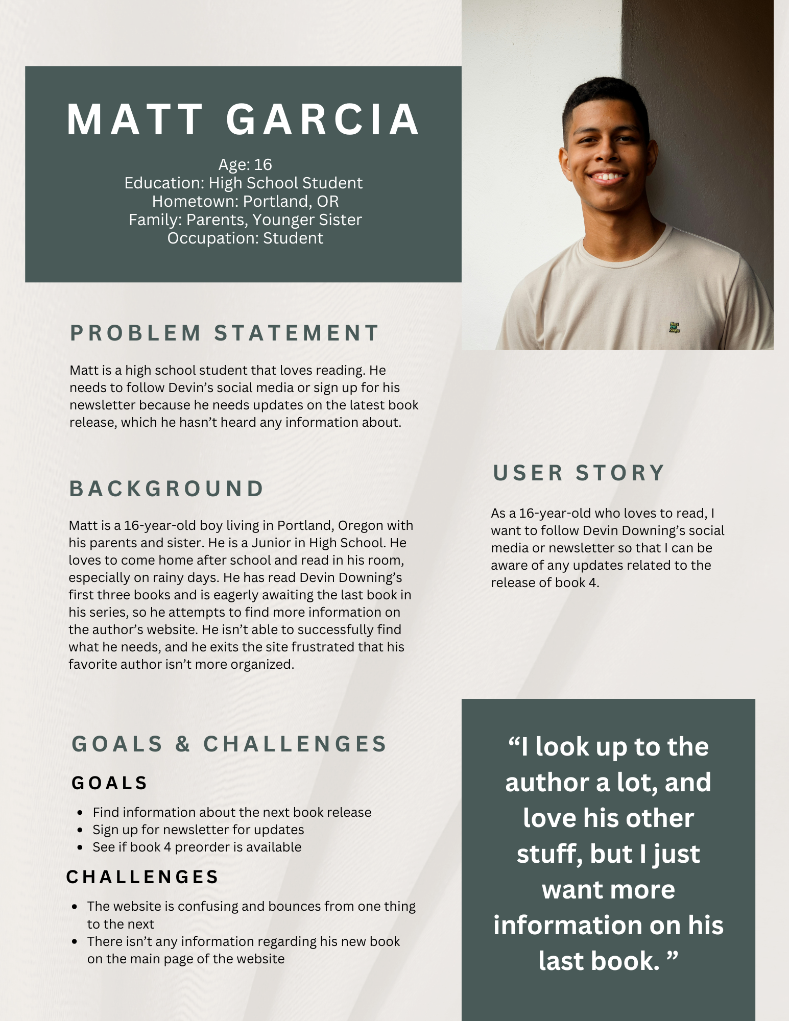
User Personas
User personas help keep design focused on real people, not just assumptions. By creating a profile based on actual research, I am better able to understand user needs, behaviors, and frustrations—leading to more intuitive and user-friendly experiences.
Meet Matt!
Competitive Audit
By looking at competitors’ strengths and weaknesses, I can create designs that stand out, solve user pain points better, and offer a more unique and user-friendly experience. It’s all about learning from the market to make smarter design decisions!

Ideate
Brainstorming
How Might We?
"How Might We" (HMW) is a problem-framing technique used to turn challenges into opportunities for innovation. It helps me brainstorm creative solutions by reframing user problems as open-ended questions.
How might we make it easier for users to find and access the author's books on Amazon
To increase purchases, we want to make it as easy as possible to find the link to buy.
Possible solutions: Add prominent, easy-to-find Amazon purchase buttons for each book, linking directly to the Amazon product page.
How might we add interactive features to boost reader engagement?
Reader engagement is higher when they can interact directly with the author.
Possible solutions: Introduce a new FAQ page and allow readers to submit new questions that the author and respond to, possibility of quizzes.
How might we simplify the website's navigation for better content discovery?
Confusing navigation can frustrate users and increase bounce rate of the site.
Possible solutions: Sticky navigation bar, hamburger menu on digital version, more pages with better organization
User Flow
My next step was to block out the user flow throughout the website. This helps improve usability and gives me a clear user flow to track through the site.

Paper Wireframing
My first step in designing the site is paper wireframing. This is a low cost way for me to rapidly try out as many ideas as possible by exploring layouts, testing different structures, and iterate rapidly without getting caught up in details. By focusing on the overall user flow and key elements, it helps me identify potential issues early in the design process and select key elements I would like to use in my later designs.


Screen Size Variations


Digital Wireframes
Digital wireframes take rough ideas and turn them into something more structured and interactive. They’re all about laying out content, navigation, and functionality without worrying about colors or visuals yet. Using Figma, they make it easy to tweak and test layouts before going too deep into the design. It’s a simple but super important step to make sure everything flows smoothly before adding the final details!


Prototype
Connecting
Mockups
Mockups bring designs to life by adding visuals, colors, typography, and branding to wireframes. They’re the first look at how a final product will actually feel, making it easier to spot design issues before development. This step is all about refining details, making sure everything looks cohesive, and ensuring the design is both functional and visually appealing.


Prototypes
Prototypes take designs a step further by making them interactive, letting me test how everything flows before it’s fully built. They help me see if the user experience feels smooth, catch any problem areas, and get real feedback from users. I use prototypes to bring ideas to life, whether it’s a simple clickable wireframe or a more polished version of the final design. It’s all about refining and improving before anything goes live!
Testing
Usability Studies
Moderated Usability Study
I ran two usability studies to see how real users interacted with my designs. The first study, after the lo-fi prototype, helped me catch early usability issues and refine the overall flow. The second study, after the hi-fi prototype, focused on the details, making sure the experience felt smooth and intuitive. Both studies gave me valuable insights that shaped the final design, helping me create a product that truly works for users.
How intuitive is the navigation for users with different familiarity levels with the author and technology?
How easy is it for users to find book-related information, such as purchasing options and author updates?
What percent of users are able to complete key tasks efficiently without confusion?
Is there anything that the majority of users are having a hard time locating while in on the site?
How do users perceive the overall aesthetics and usability of the website?
Research Questions
Moderated usability study with 5 participants taking place on December 18th.
Data will be collected by audio and video recording. My own observations will be recorded on sticky notes during the interview.
Each round will involve five participants, each representing a different target user type. The study will be conducted remotely via Figma’s prototype link, with users guided through a structured set of tasks.
Data will be analyzed using an affinity diagram.
Methodology
Participants will be people who have varying levels of familiarity with the authors works.
3 male, 2 female, ages 16-63.
No users of assistive technologies. Find one?
Incentive: Free signed copy of the author’s first book.
Participants
Time on Task
User Satisfaction Rate
Task Success Rate
Key Performance Indicators
Script and Findings
Prompt
How would you go about finding more information on the author’s background?
Follow-up 1: Did you find everything you expected?
Follow-up 2: Was any information missing or hard to find?
If you wanted to see if the author has any upcoming book releases or signings, where would you look?
Follow-up 1: Try it now, please.
Follow-up 2: How would you expect this information to be displayed?
How would you sign up for notifications or newsletters if you wanted to stay updated?
Follow-up 1: Was the sign-up process clear and straightforward?
Follow-up 2: Did you consider that social media might be a good way to subscribe to information?
After exploring the site, you want to return to the homepage. How would you do that?
Follow-up 1: Did the navigation work as expected?
Follow-up 2: What improvements could make this experience better?
You have interest in one of Devin Downing’s books. How would you find information about his books on this website?
Follow-up 1: If you were interested in purchasing a book, how would you proceed?
Follow-up 2: How easy was it to find book-related information?
Round 1 Findings
Some users thought that the Books page looked too confusing/wordy.
Some users were frustrated that there was not a way to preorder the new book.
Most users thought that the carousel on About page was a bit confusing/ messy.
Round 2 Findings
The purchase process was not immediately clear to users unfamiliar with the author’s works.
Users felt the contrast wasn’t high enough on the books page.
Some users hesitated at the purchase step, not wanting to be redirected.
Iteration is a huge part of my design process because no design is perfect on the first try. Testing and feedback always reveal ways to make things better, whether it’s tweaking a layout, adjusting a flow, or reworking a feature to be more user-friendly. Each round of changes gets the design closer to something that actually works for real people.
Iterations


Most of my iterations consisted of improving organization and condensing information in a way that improved the overall feel of the site.
Thank you for your time. Please don’t hesitate to reach out to me about reviewing more of my work.